

I commissioned an amazing athame from Omega Artworks in 2016 – here are details and photos.
A few notes:
Alt-text for the images is brief, since I describe the details in the surrounding text of this page. You can click on the images to get a larger version of the image.
I’ll be explaining some symbol details, but not all of them. (This being a personal ritual tool). I’m open to questions about things not mentioned here via my contact form or email, but please respect the fact there are things I might not go into (especially with strangers.)
The design choices here are very deliberate, but not always traditional.
Photographs:
I’ll start with a big photo of each side, and then close up photos of details.
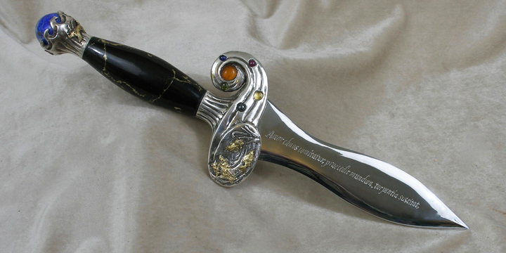
Front
Front of the athame, showing the pommel with a deep blue stone held in place by a crown of waves, a hilt of gold-veined onyx, spiral on the right curving from the amber sun with five small stones, around to a pond, then a leaf-shaped blade below. (We’ll come back to details on the crosspiece.)
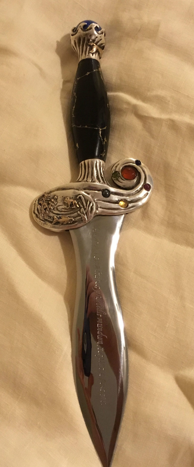
This is the athame from the front (I am defining ‘front’ as ‘where the text on the blade starts’.)
The pommel has a large round lapis stone, held in place by waves, with a whale swimming beneath them. The handle itself is made of gold-veined onyx.
The crosspiece starts on the right, spiraling out of an amber sun (the amber is set so it goes all the way through, so it will glow when the light is behind it), spiralling out with stones for the five visible planets, into a pond with althaea officinalis plants (marshmallow), a fish, and a frog.
There is text on the blade: I’ll come back to that in a minute, too.
Here’s a better detail of the pond scene on this side. (The other side is different.)
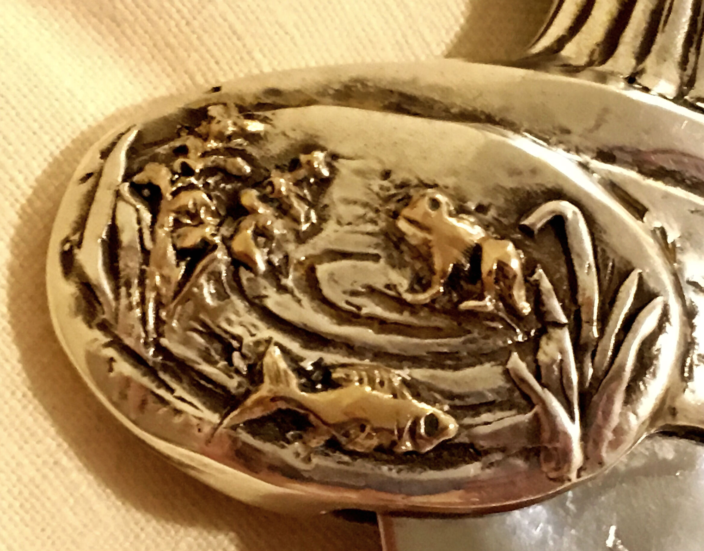
I particularly like the balance of the flowers on the left, and the reeds on the right. Althaea, if you’re wondering why that’s there, is the name I took for my 3rd degree.
Back
Here’s the athame from the back: you can see how the spiral of the sun is now on the left, with the same stones, but leading down into a different pond.
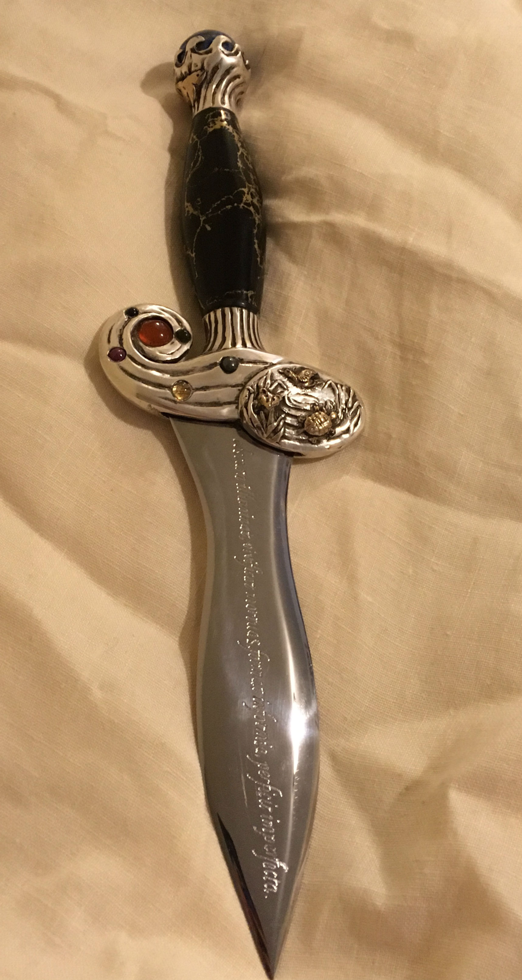
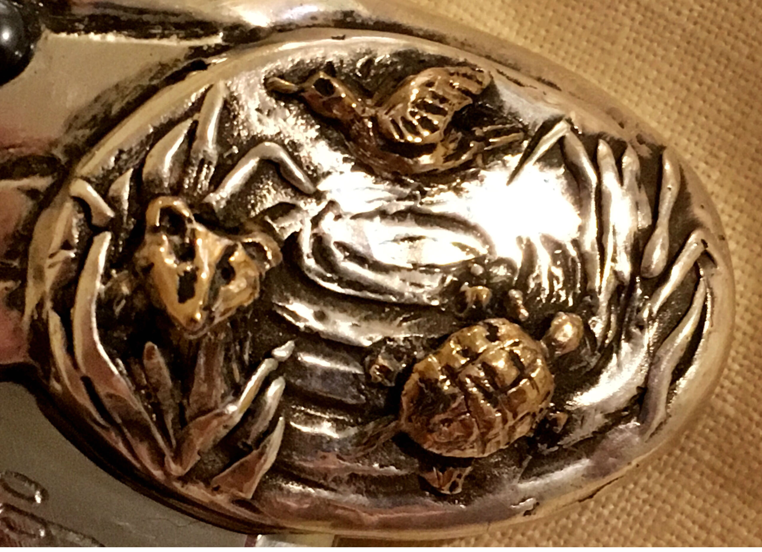
This pond has very similar reeds at the bottom right, but a badger at the left, a bird flying in the air, and a turtle.
And here’s a shot of the detail of the pond on the back. I love the expression on the badger’s face, and how she’s peering out of the reeds.
Pommel
The pommel is worth looking at in more detail: here, you can see the precision of the waves, and the orca underneath them. I love the double layers! I wasn’t able to get a good shot of the depth of the lapis, but it’s a really beautiful piece in its own right.

Sun and planets

One of the pieces I’m most pleased about with this is the sequence of sun and planets. I wanted something celestial in here, for various reasons, but constellations themselves are a little tricky. What we decided on was the central sun, and then the five planets visible with a naked eye from Earth. (Five being a reasonable number to fit into the space and also magically relevant.)
Here, you can see the amber at the center, then the stones spiraling out and down towards the pond on the other half of the crosspiece. The central amber piece goes all the way through, and the planet stones are smaller, and set into the spirals.
I chose the stones based on astrological associations after looking at a variety of sources, and then modifying them for stones I liked, colour and stone preferences of my own, and what they had stones for or that were relatively easy to arrange.
They are, in order:
- Sun : amber sphere, goes all the way through.
- Mercury : green peridot (sorry, the green doesn’t show very well.)
- Venus : lab-grown sapphire (also my birthstone, so I particularly wanted a sapphire in there.)
- Mars: lab-grown ruby
- Jupiter : citrine
- Saturn : hematite
I’m particularly pleased at having managed to get all four of the primary elemental colours used in my tradition (green, blue, red, and yellow) without actually having thought about that, and in that sequence. Plus the fact that Mars and Venus are the same material but with very different appearances, and that Jupiter and Saturn echo the idea of expansion and contraction and polarities by being light and dark.
Likewise, we have a mix of once-living material (the amber), natural stones (the peridot, citrine, and hematite) and lab grown (the sapphire and ruby). That’s a glorious cosmos of materials and possibilities.
The text:
The full text reads: (broken in half on the blade as below)
Amor chaos comitatur, praecedit mundum, torpentia suscitat,
obscura illuminat, vivificat mortuas, format informia, perficit imperfecta.
It is a sentence I first came across in relationship to a long-term creative project, for one of my characters. It’s from Marsilio Ficino‘s De Amore, his commentary on Plato’s Symposium, and one of his works not often translated into English.
Ficino was a Renaissance scholar, musician, and magician based in Florence who was one of the generation of people reviving interest in and doing translations of classical texts, and having conversations with them. If you are intrigued about this kind of thing, I have to recommend Jo Walton’s Thessaly trilogy of novels to your attention.
He also did some really interesting theorising about magical aspects of music, which is where I came across him originally, doing the kind of research in college you do if you happen to be majoring in both music and Medieval/Renaissance Studies.
What does it mean? “Love walks along with chaos, precedes the world, wakes the sleeping, lights the dark, gives life to the dead, forms the formless, and perfects the imperfect.”
The “Comitatur” is particularly tricky to translate: dictionaries tend to give it as ‘accompanies’ which doesn’t quite feel right to me. If you look at expanded definitions, you see: “to join as an attendant, accompany, attend, follow” and “to attend to the grave.”
It’s a complicated sort of verb.
One of the things I love about this sentence, though – and part of why I chose it for an athame, a tool about dual edges and discernment and things that are separated and unified, both, is the parallelism in the structure. Pairs of words, space between them.
And as far as what I want my magic to do, my life to do, my religion to do – those are pretty good goals. And ones I’m pretty sure I can keep working on for a long time to come.
Why Omega Artworks?
Their website bio has all the details I won’t go into here about their background and training.
I started getting involved in the Pagan community in Minnesota (in 2001) at just about the point they started having to be less active, due to health and other considerations – but I kept hearing about their craftsmanship and work and general awesomeness.
Starting in about 2003 (after my first degree initiation), I started looking around for an athame that really felt right, and kept failing. I looked at existing options, and found several over the years that were okay but not great. I reached out to several different people for custom work, and in each case, it fell through for some reason. (And I generally took these as ‘not the right person or at least not at this time’.)
My financial ability waned and ebbed a bit in here too. (A year of being unemployed will do that to you, plus a cross-country move.)
But in 2015, I started poking around again, because it felt more and more wrong to not have an athame that felt right to me, and knowing that this is a ritual tool that should be key to my practice.
And this time, everything went very smoothly! I emailed, they gave me basic information about costs and time frame for custom work, and that what I was vaguely interested in was possible. We then figured out that we’d all be at Paganicon in the spring of 2016.
On the Saturday, I went by, talked to them for maybe half an hour (and had a chance to feel the weight of some of their stock pieces in my hand, see what some materials looked and felt like in person, and got told to come back on Sunday, when I got presented with a sketch of something pretty close to the final piece (minus some details, like some specifics on the crosspiece, and the decision to use text on the blade rather than some sort of decorative line.
I was delighted, paid them a deposit, and went home. In mid-September (just about when they said I’d come up in the queue) they emailed, we went over a few details, and they finished it on October 5th, and it showed up at my apartment the next week.
Every stage of the process flowed wonderfully, and it was a delight to work with both of them (and to know I was getting a truly unique piece of art with tons of buried meaning and symbols).
One final photo: for people who’ve seen photos before I got it in hand, it looked a little different. The original version had gold leaf on the animals in the pond and the orca, but between when they’d emailed me to let me know it was done, and when they could ship (a weekend festival for them being in between) they decided that that wasn’t the right thing, and pulled the gold leaf. I agree with the more subtle effect.
What you see now (and in the previous photos) is the difference between the bronze of the underlying material and the silver plating. Here’s a shot of the silver plating with the gold leaf.
Last edited December 1, 2018. This article is a repost previously found on my Limen blog.


